Practical and affordable flyer for maximizing returns!

Client
Ecobay Technologies Limited
https://ecobay-tech.com/
Credit
Designer - Shela Yuen
Project date
Aug 2024
Category
Flyer Design
Custom service
Design tool
Canva
Adobe Illustrator
Project goal
We were so glad to design a compact and practical flyer for Ecobay to promote their new back-to-school offers. Their requirement is to address to their target audience's needs, and provide a clear comparison on how their offerings is better than the existing practical.
Project flow
At the start of this project, we asked the client for their existing brand guideline, any competitor's flyers that they think are absolutely well designed. From there, we learnt about their expection and what they want to achieve.
We also provided a quick suggestion on what sections a compact and effective flyer should contain: a hero-statement to bring out what they do and their differentiation, a catch slogan to catch attention, F-A-B approach to highlight their product's advantages and benefits, a clear comparison table to show the target audience how their offering is better, and a call-to-action section with QR code to encourage the audience to take action.
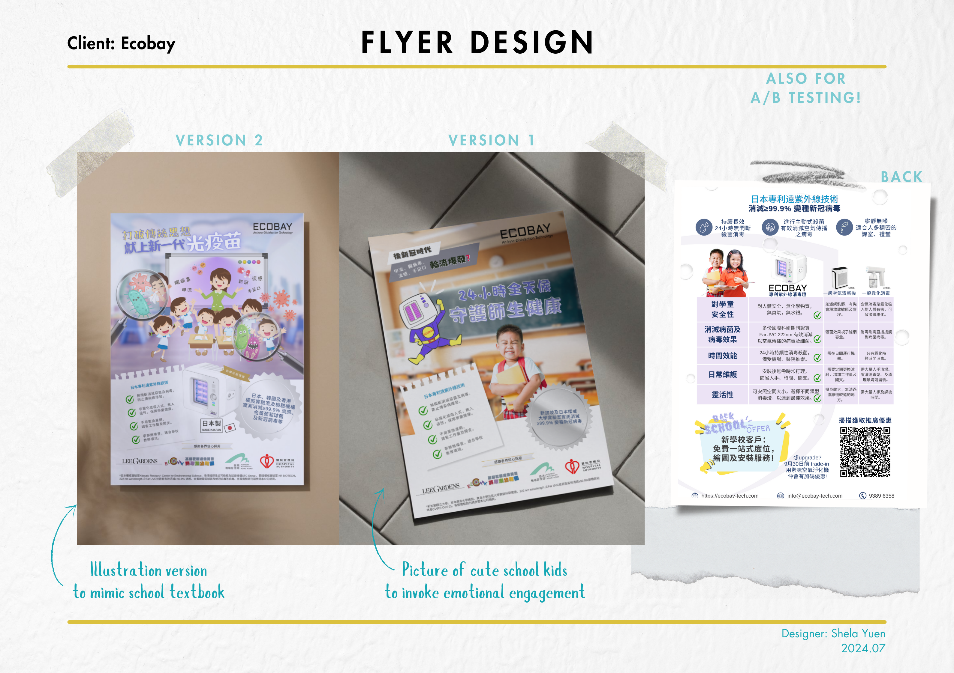
At the end, 2 versions were produced for client to conduct A/B testing, to maximize returns!
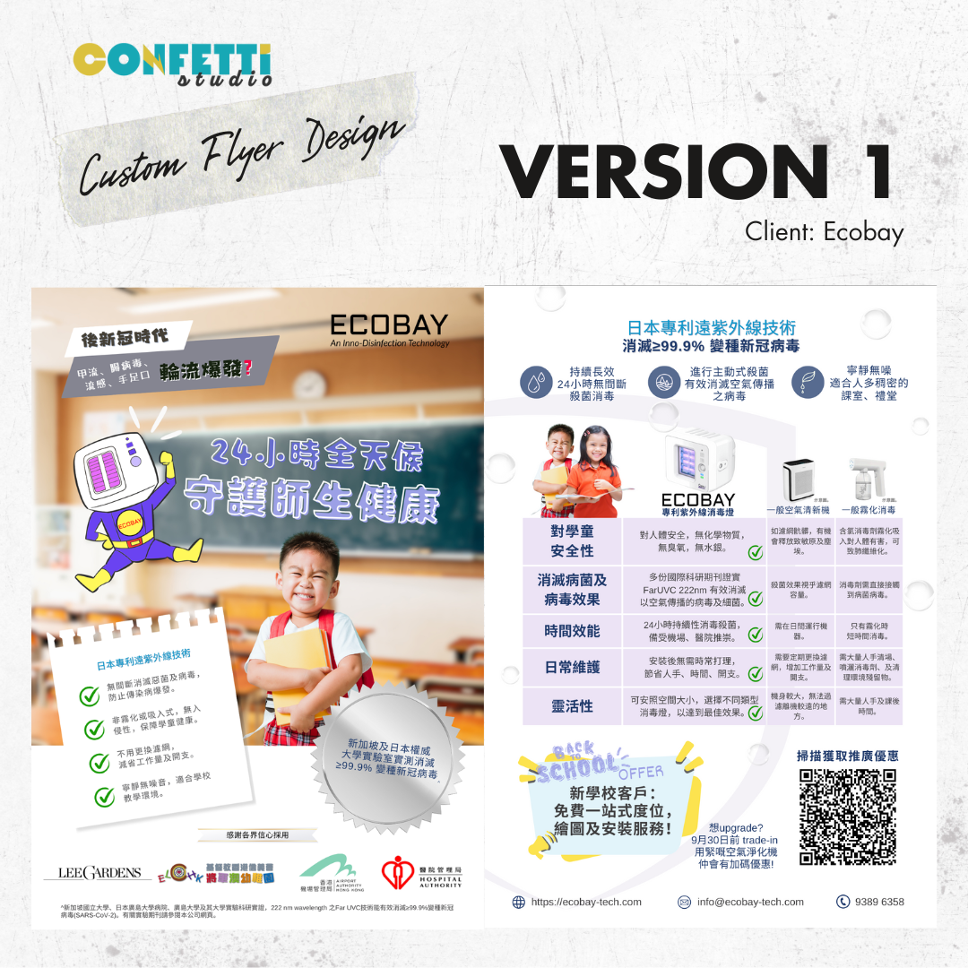
Version 1 - evoke emotional engagement
In this version, we used several techqniues to relate to the target audience and evoke emotional engagement:
- Cute school kids picture - To evoke target audience (which are teachers and principals) desire to ensure every kid on campus is happy and safe.
- Disturbance - On the top left corner, clearly stated audience' pain point, which is frequent flu outbreak on campus after the pandenmic.
- F-A-B - Clearly stated all product benefits on the note-paper on the left.
- Social Proof - Logo of clients that has used Ecobay's product.
- Comparison table - Compare the product to most commonly used alternatives at target schools - which are air purifier or mist disinfectant.
- Call-to-action - Included a QR code for target audience to scan and linked to sales team's whatsapp account.

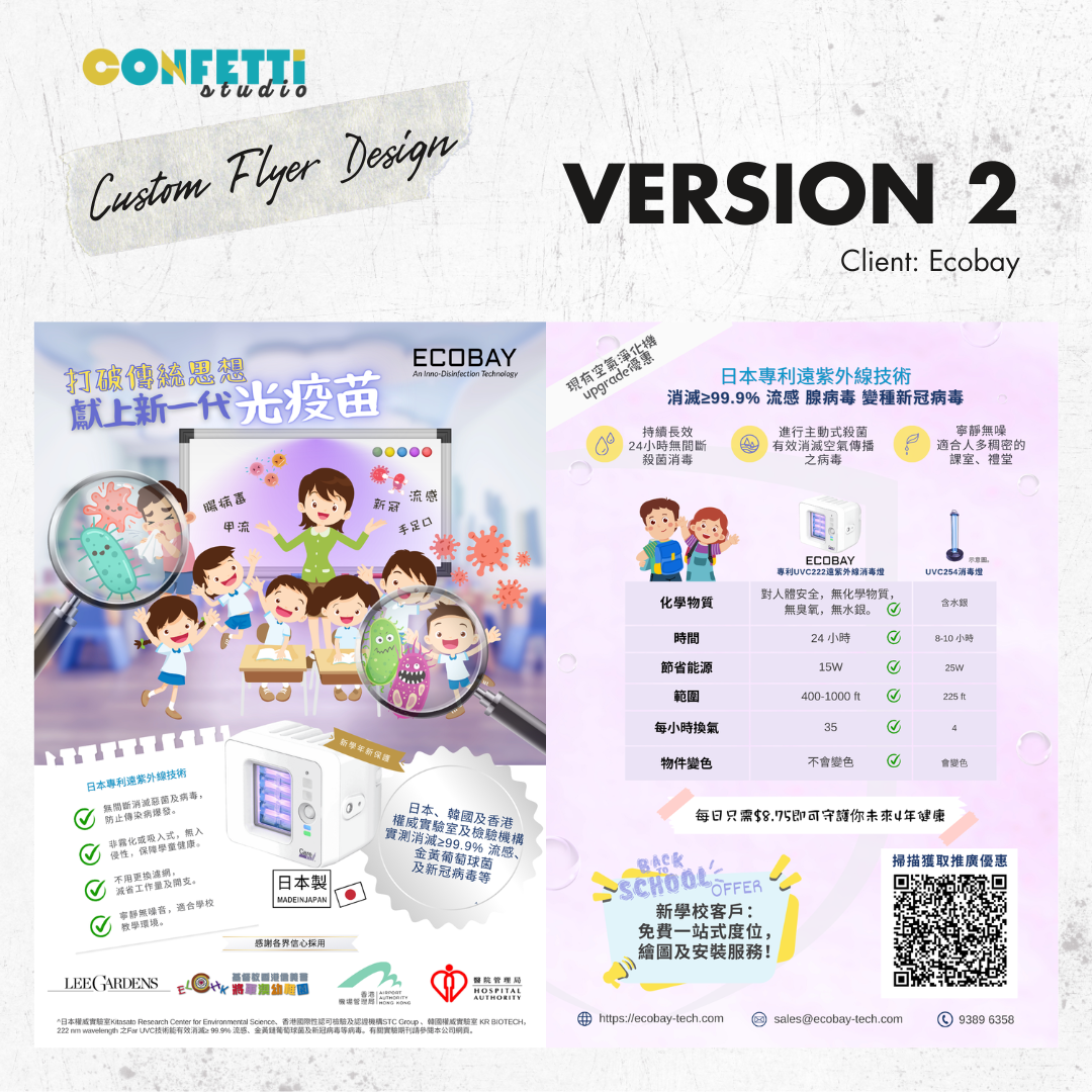
Version 2 - alternative for A/B testing
In the second version, we have produced another version for client to do their A/B testing:
- Textbook illustration - to mimic the textbook feeling with illustration.
- Comparison table - Compare the product to another competitor's product.
- Look and feel - Using the client's product color, purple, for the whole leaflet to impose a perception.

Client’s testimonial


"From Shela's first draft of the flyer design, I can feel how passionate she is about design and how much thought she has put into our flyer. She also has a strong sense of business acumen which drastically shorten the time we need to think about what content to put in the flyer. She is more than a designer! Thank you so much!"