Brand design that brings out the essence of brand

Client
Hermony Ltd
@hermony_ltd
Credit
Designer - Shela Yuen
Project date
Oct 2024
Category
Brand Design
Custom service
Design tool
Adobe Illustrator
Project goal
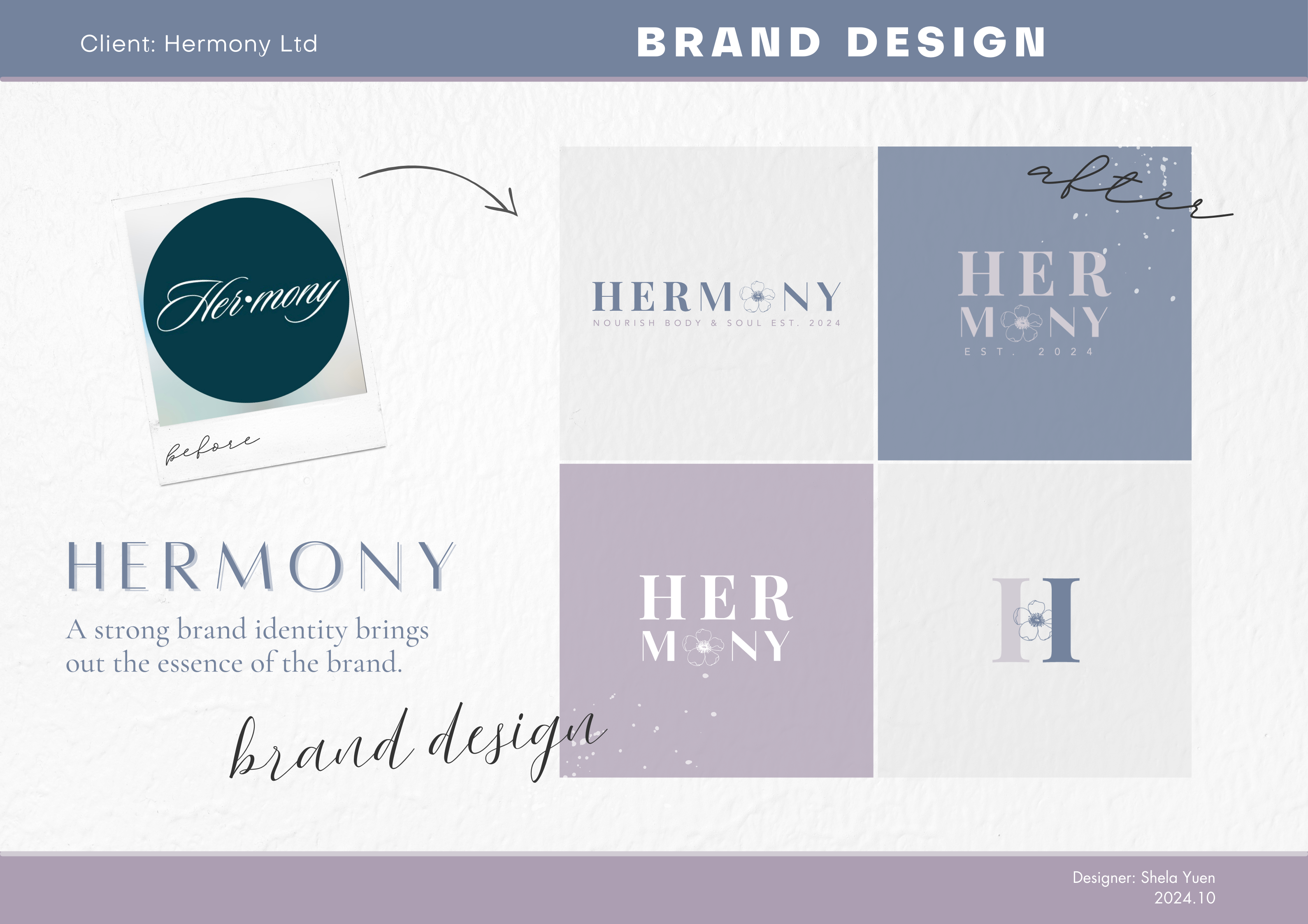
HHermony Ltd is a wellness brand that provides premium, natural, and healthy products tailored for women living busy, modern lifestyles. They specialize in selling traditional Chinese herbal tea designed to help women nourish their bodies, but with a modern, convenient twist in packaging. Our goal is to bring out the essence of their brand in a new logo design.
Project flow
We first started by auditing their existing Instagram account, and a brand discovery questionnaire to understand their brand's core values, mission statement and differentiation. We also understood more about the preferred colors and styles that they wanted to achieve.
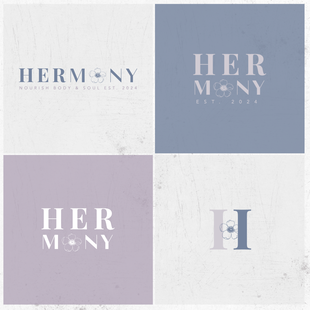
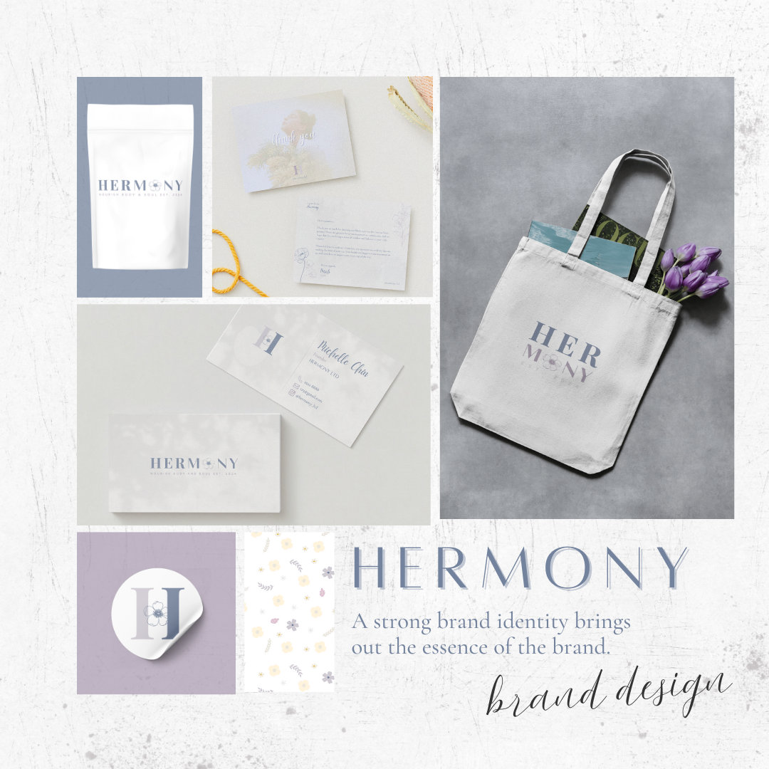
Then, in the first design iteration, we offered a brief draft of 5-6 kinds of logo design and ask them to pick the one they like most, in 2 distinct sets of color palette. After narrowing it down to one set of color palette and 2 designs, we tried out different fonts that go well, and went on editing the fine details with Adobe Illustrator. Primary logo, secondary logo, submark, in different color variation and format were exported for the client's use.
The new logos
In this new logo, we use the white anemone flower to reflect the strength of feminine energy, and uses serif + san serif font to align the vision of the brand that combines traditional wisdom with modern twist.

