Creating a long-lasting logo that represents the brand
Client
Miller's Meatcraft
millersmeatcraft.ca
Credit
Designer - Shela Yuen
Project date
Jul 2024
Category
Branding
Logo Design
Custom service
Design tool
Adobe Illustrator
Project goal
We had the pleasure to design a new logo for the exciting re-branding project for this client - Millers Meatcraft. Millers Meatcraft is a specialty butcher shop loved by the community of Bowen Island, BC. They were undergoing a transformation into a new brand name with a modern look and feel. Our goal was to help them design a new logo that represent the brand and the soul of the brand - the owner.
Project flow
At the start of this project, we asked Mr. Miller several questions to obtain his design preferences. We used an effective questionnaire to make sure our designer and the client were aligned on the same page.
We learnt that Mr. Miller likes design that is traditional, clean and simple. His favorite colors are black and white, also natural colors like sand or neutral. We asked him to provide reference pictures of the styles he likes. He also had several favorite fonts in mind which was really helpful.
First design iteration
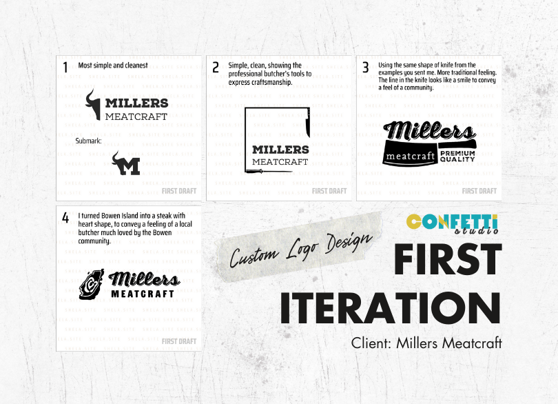
Our designer quickly create a draft of 4 variations. These draft are rough combination to get a design direction that fits the client’s preference. The third logo got his heart right away and he really likes the graphic of fourth too!
Second design iteration
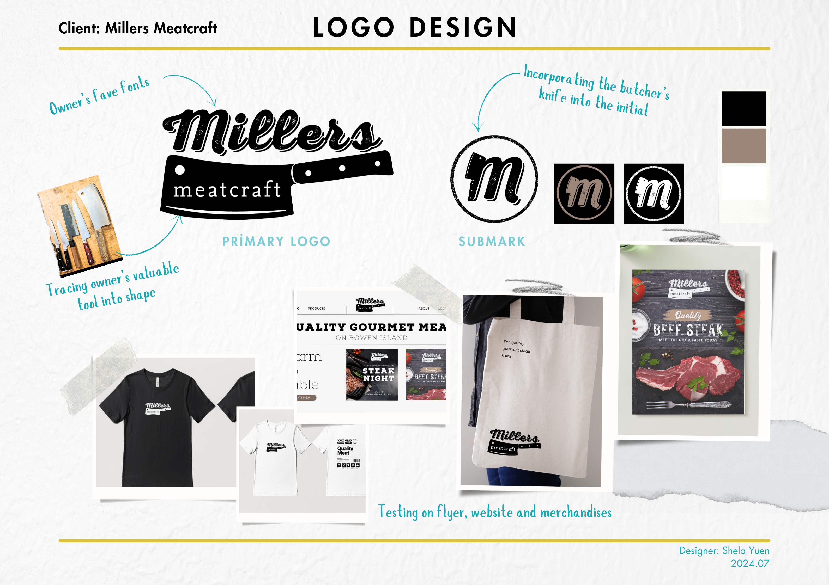
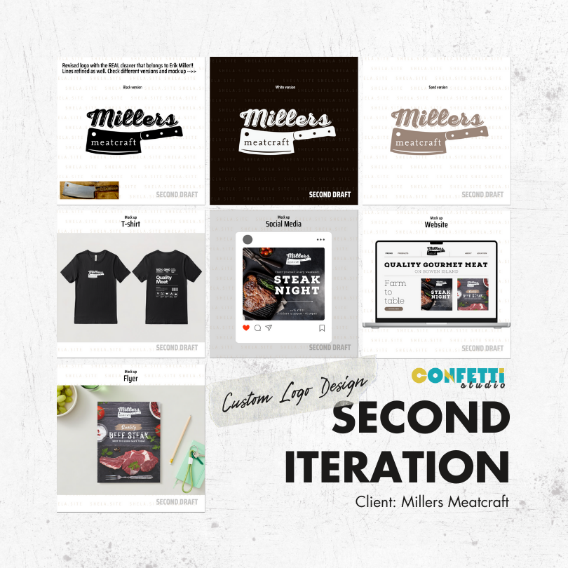
In the second iteration, our designer started to customize the line and shape into something truly meaningful to Mr. Miller. We asked him to send us a picture of the valuable tools he uses daily, and traced the exact shape of the iconic butcher’s knife (the cleaver) and used it in the logo. It’s meaningful to Mr. Miller as it is not just any cleaver. It is HIS cleaver!
Third design iteration
Mr. Miller absolutely loved the new customized logo and approved! In the final iteration, the designer proceeded to try different color combination on the logo. Turned out, single color has the best effect on the logo and able to fit the client’s preference - clean and simple. Therefore, the designer produced a black version, a white version, and also a sand color version of the logo, so that the client can use it for every situation with dark, light or colorful backgrounds.
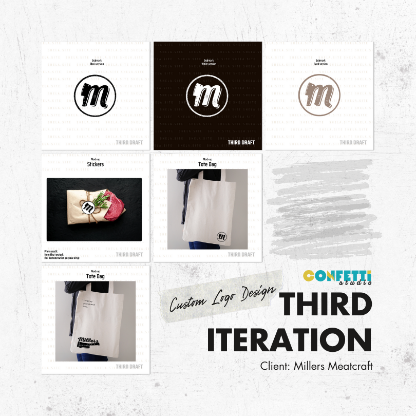
With the primary logo approved, designer further simplified it into a submark using the first letter of the brand name. To make it more special, the client’s cleaver was incorporated into the letter, and confined in a circle to replicate the look and feel of a stamp.
Client’s testimonial


